

Stephanie
2 August 2016
The App Design Guides go live (bit by bit)
The App Design Guides have a new design and content refresh to better communicate the new convergent UI toolkit, and visualise best practice for designers and developer wishing to build an app or scope on Ubuntu. We will be posting these guides over the coming days and weeks.
What’s to come…
Phase 1 – Get started and Building blocks
The first section of the guide showcases the rationale behind our design values and philosophy, as well the convergence story, and reasons why you should design for Ubuntu.
The building block section will contain all the components you need to start building your application. It will feature UI examples of how the component will look inside an app across screen sizes, as well as breaking them apart so you can see what goes where, and how.
See it here.
Phase 2 – Patterns
Patterns will include best practice solutions for using navigation, gestures and our predefined layouts which allows for an adaptive layout.
Phase 3 – System integration
System integration will feature the number of a touchpoints your app can plug into inside the Ubuntu operating system shell, such as the launcher, notifications and indicators. For example, you can add a count emblem over your app icon inside the Launcher to show unread messages or available updates.
Phase 4 – Resources and Style
Resources will include handy downloads such as the color palette, icon set and fonts to get you on the way to building your very own Ubuntu app.
What has been changed?
New design:
- We reduced the copy to be more concise and understandable
- Added detailed visuals to show interactions in real app situations
- Introduced quick takeaway information boxes for advice and developer links to API documentation
- Consolidated some sections and added new content based on user testing
Here’s a sneak peak…
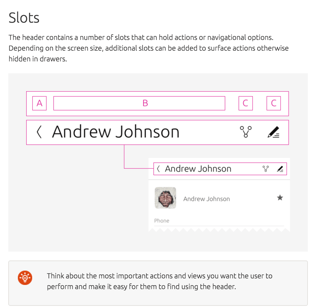
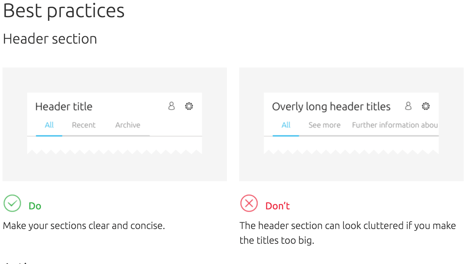
New sections
As well as ‘Get Started’, ‘Patterns’ and ‘Building blocks’ we will now introduce: ‘System integration’ and ‘Resources’ to the list, as well as an overview page for each section highlighting key areas.
Why do we need guidelines?
The guidelines are a big part of communicating design practices and philosophy to the community and the wider audience. Without it, we wouldn’t have consistency in our design language and people who want to develop or design on Ubuntu wouldn’t be able to maintain the identity we so love.
Throughout the guide you will see the rationale behind our design values through the development our Suru visual language and philosophy.
Over to you…
We can’t wait to see your app designs and hope that our design practices will help you achieve a great user experience on Ubuntu.


